As a developer, you know that mobile traffic dominates eCommerce. Imagine your clients’ customers scrolling through their phones, searching for products. What if the store you built captured their attention instantly?
In today’s world, a mobile-friendly Shopify store isn’t just an add-on—it’s critical. With most shoppers browsing and buying from mobile devices, a mobile-first design approach ensures a seamless user experience, leading to better engagement, more sales, and improved SEO performance.

This guide is designed to help you, as a developer, build a Shopify store that attracts mobile users and optimizes their experience. We’ll cover the key techniques, best practices, and tools you need to create a mobile-first store that performs and converts. Let’s get started!
Why Mobile-First Should Be Your Top Priority?
The mobile-first design approach emphasizes building your website for mobile devices first, rather than desktop computers. This means you’re focusing on making sure everything looks great and works smoothly on smaller screens and touch interfaces. It’s a great way to improve the user experience!
Here are some compelling reasons why adopting a mobile-first design is so important:
- Increasing Mobile Traffic: The trend towards mobile shopping is undeniable. A significant percentage of users shop via mobile devices, making it essential to cater to this audience.
- Improved User Experience: A mobile-first design provides a seamless experience, reducing loading times and making navigation easier. This leads to lower bounce rates and higher engagement.
- SEO Benefits: Google uses mobile-first indexing, meaning it prioritizes the mobile version of your site for ranking purposes. A well-optimized mobile site can improve your visibility in search results.
- Higher Conversion Rates: Mobile-friendly stores have higher conversion rates as they provide a smoother shopping experience, leading to increased sales.
Step-by-Step Guide to Creating a Mobile-First Shopify Store Design
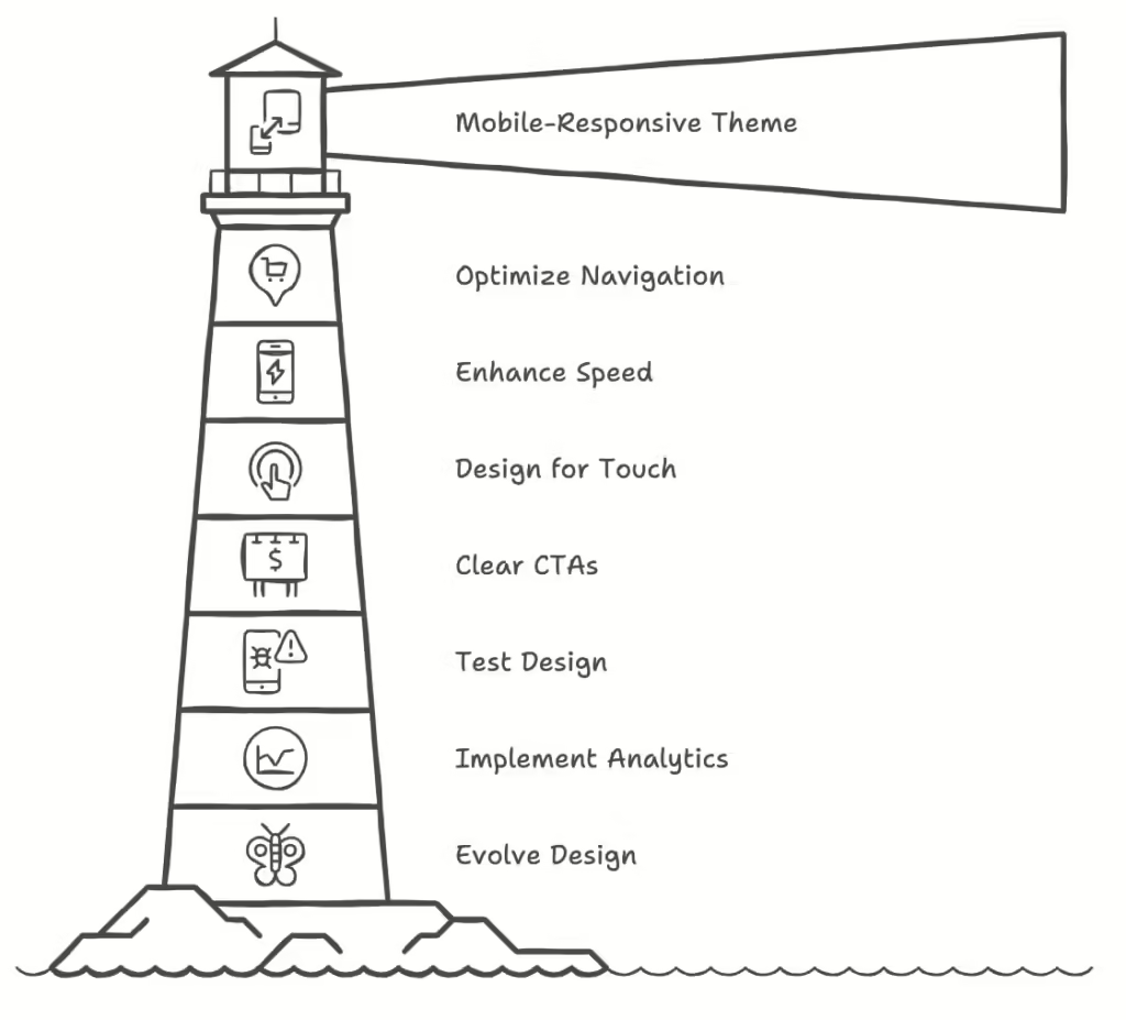
1. Choose a Mobile-Responsive Theme
The first step in creating a mobile-first Shopify store is selecting an inherently mobile-responsive theme. Shopify offers various themes that are designed to look great on both mobile and desktop devices.
When choosing a theme, consider the following:

- Responsiveness: Ensure that the theme adjusts well to different screen sizes without losing functionality.
- Customization Options: Look for themes that allow you to customize colors, fonts, and layouts to match your brand.
- User Reviews: Check reviews and ratings from other users to gauge the theme’s performance and usability.
Additionally, leveraging DhiWise’s Figma to Shopify liquid tool can help you convert your design prototypes into functional Shopify themes more efficiently.
To find a suitable theme, navigate to the Shopify Theme Store and use filters to narrow down your options to mobile-responsive themes.
2. Optimize Your Navigation
Navigation is crucial for providing a good user experience, especially on mobile devices where screen space is limited. Follow these tips to optimize your store’s navigation:
- Simplify the Menu: Keep your navigation menu concise. Limit the number of top-level categories to avoid overwhelming users. Use dropdown menus for subcategories to maintain a clean look.
- Use Descriptive Labels: Ensure that your menu items have clear and descriptive labels that help users understand where each link leads.
- Incorporate a Search Bar: Adding a search bar allows users to find products quickly, enhancing the shopping experience.
- Prioritize Important Links: Place the most important links (like shop, contact, and cart) at the top of your mobile navigation for easy access.
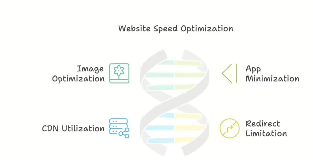
3. Focus on Speed and Performance
Page load speed is a critical factor in user experience and SEO. Mobile users are often on the go and may abandon a site that takes too long to load. Here’s how to enhance your store’s speed:
- Optimize Images: Compress images to reduce their file size without sacrificing quality. Use the correct image format (JPEG for photos, PNG for graphics) to further improve loading times.
- Minimize Apps: Each app you install can slow down your site. Evaluate your installed apps and remove any that you don’t need.
- Use a Content Delivery Network (CDN): Shopify uses CDNs to deliver content faster. Ensure that your store is utilizing this feature for improved performance.
- Limit Redirects: Too many redirects can slow down your site. Keep them to a minimum to enhance loading speed.

4. Design for Touch Interactions
Mobile users interact with websites differently than desktop users, primarily through touch. When designing your Shopify store, keep these touch-related considerations in mind:
- Button Size: Ensure that buttons are large enough to be easily tapped with a finger. A recommended size is at least 44×44 pixels.
- Spacing: Provide adequate spacing between buttons and links to prevent accidental clicks.
- Vertical Scrolling: Mobile users are accustomed to scrolling vertically. Design your layout to take advantage of this by stacking elements rather than forcing horizontal scrolling.
5. Use Clear Calls-to-Action (CTAs)
Effective CTAs guide users through your store and encourage them to take specific actions, such as adding items to their cart or signing up for a newsletter. To create impactful CTAs:
Be Concise and Action-Oriented: Use clear, actionable language like “Shop Now,” “Add to Cart,” or “Subscribe Today.”
Use Contrasting Colors: Make your CTAs stand out by using colors that contrast with the rest of your design. This draws attention and encourages clicks.
Place CTAs Strategically: Position your CTAs in areas where users are likely to see them, such as at the end of product descriptions or in prominent locations on the homepage.
6. Test Your Design
Before launching your mobile-first Shopify store, thorough testing is crucial to ensure that everything functions as intended. Here’s how to effectively test your design:
Use Different Devices: Test your store on various mobile devices (smartphones and tablets) and browsers to identify any issues.
Check for Responsiveness: Use Chrome DevTools or similar tools to simulate different screen sizes and check how your store responds.
Assess Load Times: Utilize tools like Google PageSpeed Insights to analyze your store’s loading speed and identify areas for improvement.
Gather Feedback: Share your store with friends or family and ask for their feedback on usability and design. Consider making adjustments based on their suggestions.
7. Implement Analytics and Tracking
To understand how users interact with your mobile store, implement analytics and tracking tools. Shopify integrates with Google Analytics, allowing you to monitor key metrics such as:
Traffic Sources: Determine where your mobile traffic is coming from to tailor your marketing efforts accordingly.
User Behavior: Analyze user behavior on mobile devices to identify any pain points in the shopping experience.
Conversion Rates: Track conversion rates to evaluate the effectiveness of your mobile-first design. Use this data to make informed decisions about future updates.
8. Keep Content Concise and Relevant
Content is key to engaging users and guiding them toward a purchase. However, on mobile devices, less is often more. To optimize your content for mobile:
- Use Shorter Paragraphs: Break text into smaller paragraphs for easier reading on small screens.
- Utilize Bullet Points: Highlight key features or benefits using bullet points, making it easier for users to scan the content.
- Prioritize Important Information: Place the most critical information at the top of your pages to ensure that users can access it quickly.
9. Optimize for Local SEO
If your Shopify store serves a local audience, optimizing for local SEO can help attract nearby customers. Here’s how to enhance your local search visibility:
- Use Local Keywords: Incorporate location-based keywords in your product descriptions, meta tags, and headings.
- Create a Google My Business Listing: Set up a Google My Business account to increase your visibility in local search results.
- Encourage Customer Reviews: Positive reviews can boost your local SEO rankings. Encourage satisfied customers to leave reviews on your Google My Business page.
10. Keep Evolving Your Design
The digital landscape is constantly changing, and so are user preferences. To stay competitive, it’s essential to keep evolving your mobile-first design:
- Stay Updated on Trends: Keep an eye on design trends and technology updates to ensure your store remains modern and appealing.
- Solicit Customer Feedback: Regularly ask your customers for feedback on their shopping experience to identify areas for improvement.
- Conduct A/B Testing: Experiment with different design elements, such as button colors or CTA placements, to see what resonates best with your audience.
Final Dev Reflections
Building a mobile-first Shopify store is no longer optional—it’s essential in today’s e-commerce world. By focusing on mobile users, you’ll enhance user experience, boost SEO, and drive more conversions.
Follow the steps in this guide to develop a store that not only functions smoothly on mobile but also engages customers and keeps them coming back.
Remember, continuous optimization is key. Stay responsive to user feedback and new trends, and your Shopify store will remain ahead in the mobile-first game.
